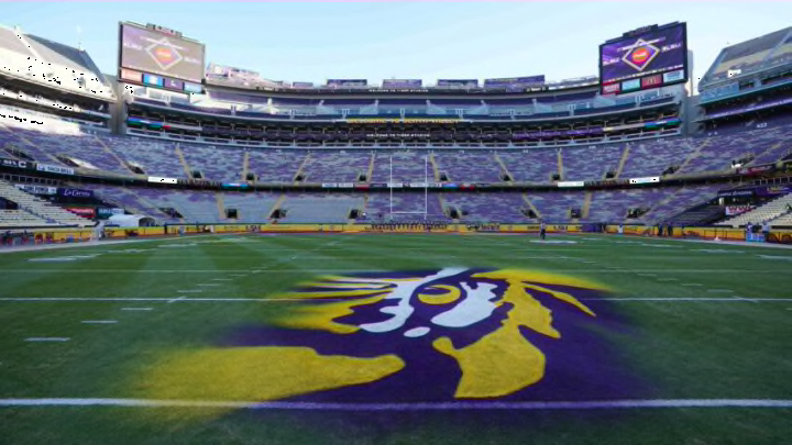
The LSU Tigers have used eight logos to represent the football program since 1955. We asked fans which is their favorite and received interesting replies.
The LSU Tigers are no strangers to logo changes regarding their sports programs. Such is ironic, considering the few changes to the LSU football uniform during the same period. Nevertheless, every logo change in Tigers’ history is dramatically different from the next.
We asked fans through the Death Valley Voice social media accounts which logo is their favorite. Credit to X (Twitter) user @NussBus2024 for beating us to the punch.
LSU fans, which is the best one? pic.twitter.com/7Yao741wYq
— #13 NBATIGERBOY🐅💜 (@NussBus2024) October 10, 2023
A lot of LSU fans prefer the original tiger head logo from 1955. The design features a cartoon-type tiger wearing a small sailor cap with ‘LSU’ adorned on its front.
“1955! Reminds me of Billy Cannon and Everybody’s All American!” -Ray F.
”1955 is pretty dope” -Luke D.
“1955 will always be a favorite!!” -Donna M.
”’55 is my favorite.” -Cassie W.
The 1955 LSU Tigers logo is a great look, but it’s not unique to Baton Rouge. The Auburn Tigers used the exact same logo in orange and blue from 1957 to 1970. We’d bet more programs with tigers for a mascot also used the cartoon feline with a sailor cap.
The 1972 logo received a lot of love from fans. It is a tiger head that is unique to LSU and lives on today in the form of an updated design that the Tigers unitize as a secondary logo.
“1972 ALL DAY!!!” -Chris M.
”1972 the best” -Kevin C.
”’72 [is] iconic” -Nicole B.
The 2002 LSU Tigers logo remains widely debated. A lot of fans love the design, but just as many dislike it. The logo features the top half of a leaping tiger over the letters ‘LSU.’
”2002 for sure” -Ethan P.
”I don’t care for ‘02” -Tom W.
”2022 was my favorite” -Joshua M.
”All of [the logos] are the best, except the 2002 logo” -Brant M.
We’re not huge fans of the 2002 logo because it is a design that screams new millennium. As such, the design incorporates a lot of black, multiple outlines, and shadowing.
The 2002 logo eclipsed the Nick Saban era in Baton Rouge and claims a national championship. However, we think most fans associate it with the Les Miles era. Thankfully, the design was short-lived and simplified ahead of the 2007 football season.
